Customization - Standard branding
The customization section defines the editor customization parameters.
Most parameters on this page are available for all ONLYOFFICE Docs editions, including the open-source community version. Some parameters are available only for ONLYOFFICE Docs Developer and are marked accordingly. If you have an extended white label license, please visit the White label page for additional customization options.
Only the following parameters are available for the mobile editors: close, feedback, goback, help, logo, macrosMode, mobile, toolbarHideFileName, uiTheme.
anonymous
type: object
Adds a request for the anonymous name.
Example:
{
  request: true,
  label: "Elizabeth",
}


anonymous.request
type: boolean | default: true
Whether the request is sent or not.
Example: true
anonymous.label
type: string | default: "Guest"
A postfix added to the user name.
Example: "Elizabeth"
autosave
type: boolean | default: true
Whether to enable the Autosave menu option. If set to false, only Strict co-editing mode can be selected, as Fast does not work without autosave.
In case this setting is changed in the editor interface, it will be stored in the browser local storage and will overwrite any values sent as the editorConfig.customization.autosave parameter.
Example: true
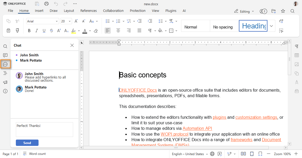
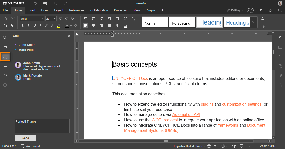
chat
type: boolean | default: true
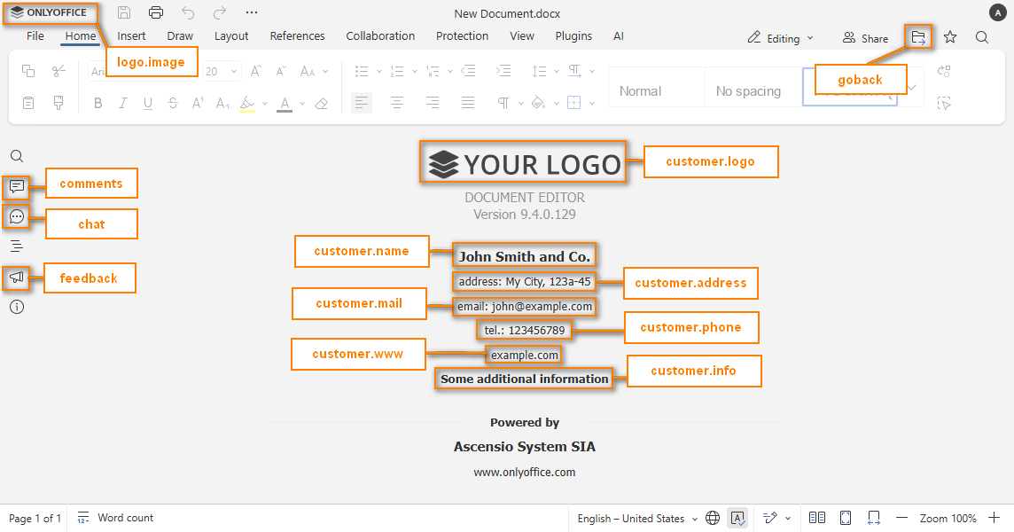
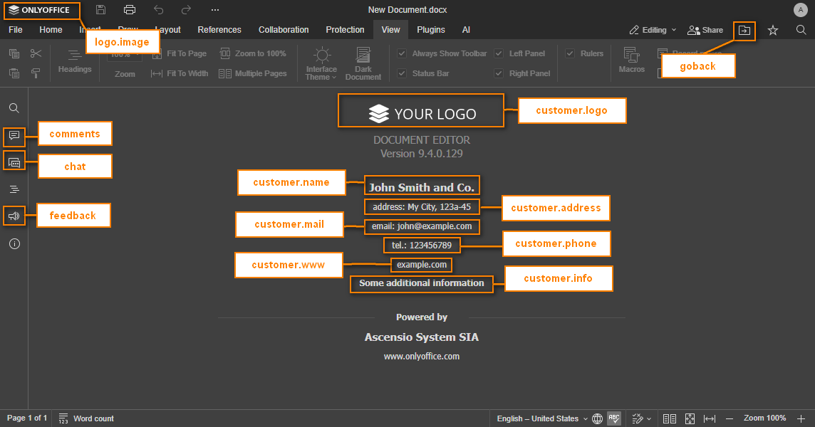
Whether to display the Chat menu button. Please note that in case you hide the Chat button, the corresponding chat functionality will also be disabled.
Starting from version 7.1, please use the document.permissions.chat parameter instead.
Example: true
close
type: object
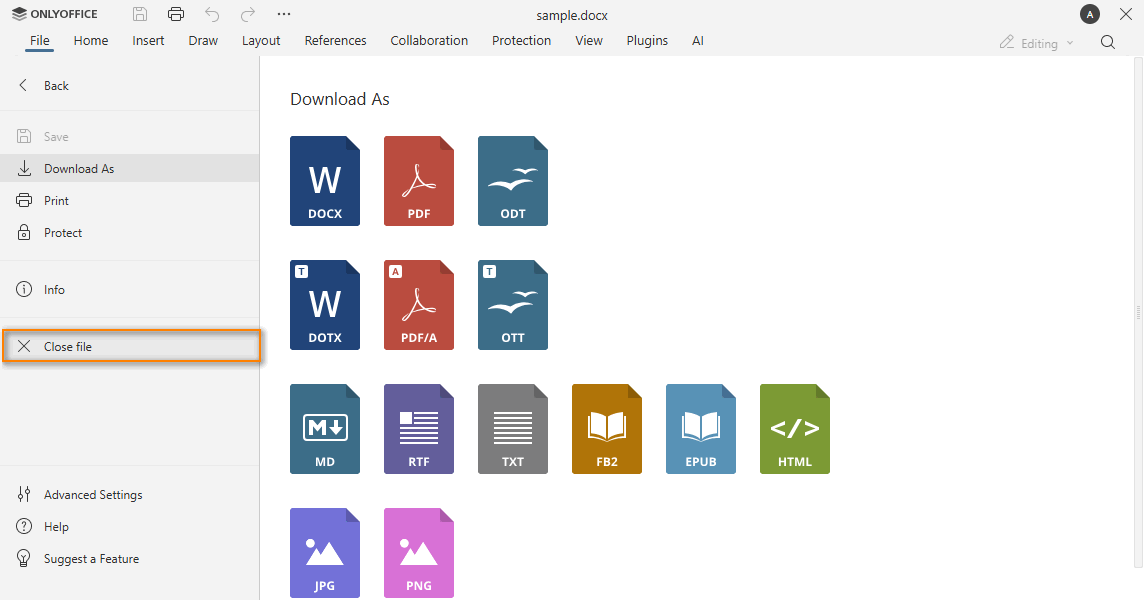
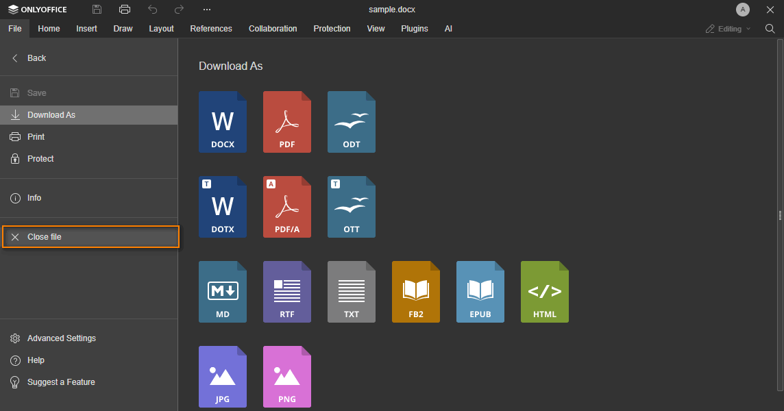
The settings for the cross button to close the editor.
Example:
{
  visible: true,
  text: "Close file",
}
close.visible
type: boolean | default: true
Whether to display the cross button to close the editor.
Example: true
close.text
type: string
The tooltip text for the cross button in the editor header or the menu item text in the mobile editors and in the File menu of the web editors.
It will only be available if the onRequestClose event is set. If the event is not declared and the close parameter is not specified, the cross button will not be displayed.
Example: "Close file"
comments
type: boolean | default: true
Whether to display the Comments menu button. Please note that in case you hide the Comments button, the corresponding commenting functionality will be available for viewing only, adding and editing comments will be unavailable.
Example: true
compactHeader
type: boolean | default: false
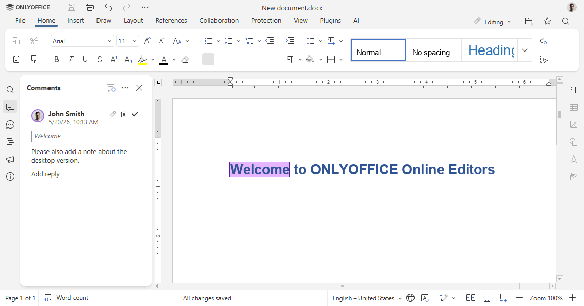
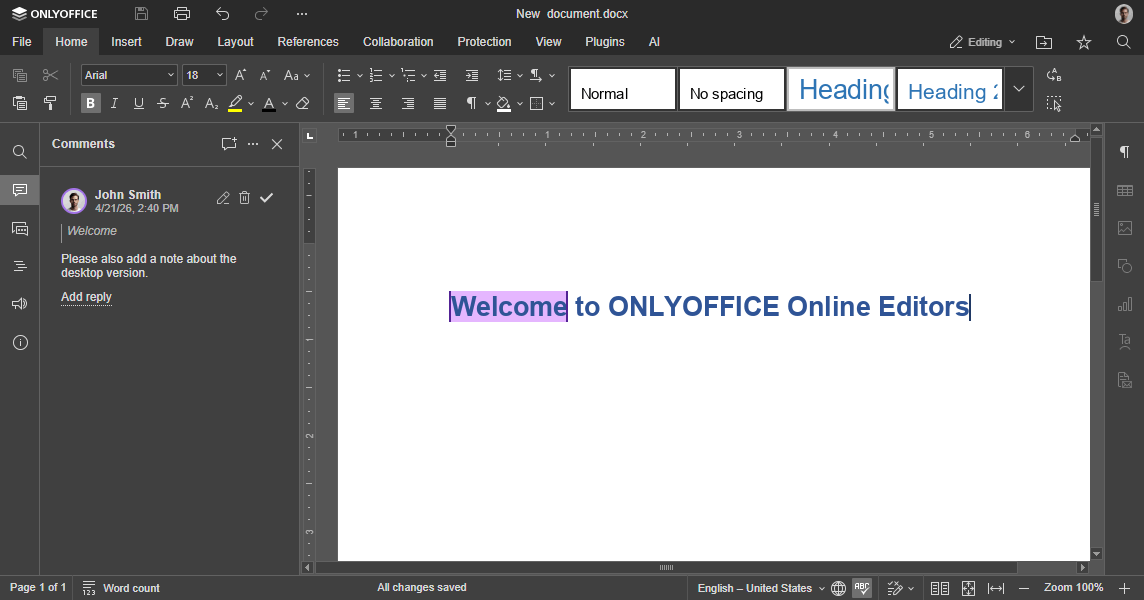
Whether the additional action buttons are displayed in the upper part of the editor window header next to the logo (false) or in the toolbar (true), making the header more compact.
Example: false


compactToolbar
type: boolean | default: false
The top toolbar type. If set to false, the full toolbar is displayed. If set to true, the compact toolbar is displayed. The default value for the view mode is true.
In case this setting is changed in the editor interface, it will be stored in the browser local storage and will overwrite any values sent as the editorConfig.customization.compactToolbar parameter.
Example: false


compatibleFeatures
type: boolean | default: false
Whether to use functionality only compatible with the OOXML format. For example, commenting on the entire document is disabled.
Example: false
customer
type: object
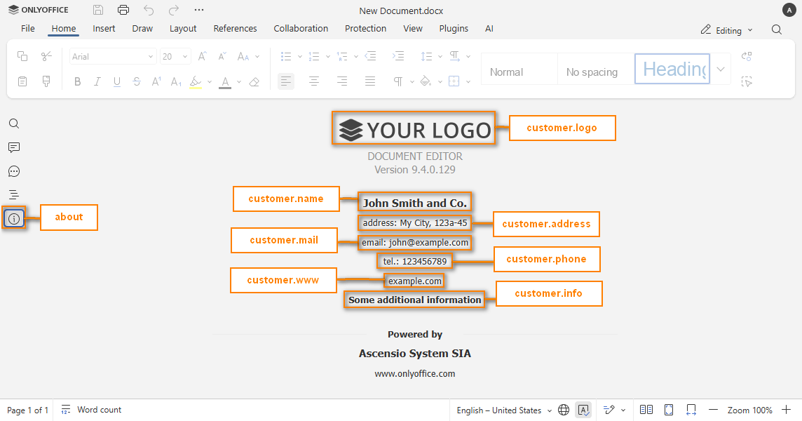
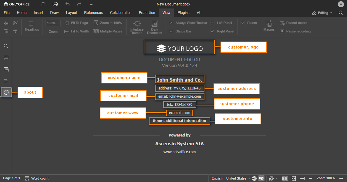
Contains the information which will be displayed in the editor About section and visible to all the editor users.
This parameter is available only for ONLYOFFICE Docs Developer.
Example:
{
  address: "My City, 123a-45",
  info: "Some additional information",
  logo: "https://example.com/logo-big.png",
  logoDark: "https://example.com/dark-logo-big.png",
  mail: "john@example.com",
  name: "John Smith and Co.",
  phone: "123456789",
  www: "example.com",
}
customer.address
type: string
Postal address of the company or person who gives access to the editors or the editor authors.
Example: "My City, 123a-45"
customer.info
type: string
Some additional information about the company or person you want the others to know.
Example: "Some additional information"
customer.logo
type: string
The path to the image logo. The image must have the following size: 432x70.
There are no special recommendations for this file, but it would be better if it were in .png format with transparent background.
Example: "https://example.com/logo-big.png"
customer.logoDark
type: string
The path to the image logo for the dark theme. The image must have the following size: 432x70.
There are no special recommendations for this file, but it would be better if it were in .png format with transparent background.
Example: "https://example.com/dark-logo-big.png"
customer.mail
type: string
Email address of the company or person who gives access to the editors or the editor authors.
Example: "john@example.com"
customer.name
type: string
The name of the company or person who gives access to the editors or the editor authors.
Example: "John Smith and Co."
customer.phone
type: string
The phone of the company or person who gives access to the editors or the editor authors.
Example: "123456789"
customer.www
type: string
Home website address of the above company or person.
Example: "example.com"
features
type: object
The parameters that the user can disable or customize if possible.
Example:
{
  featuresTips: true,
  roles: true,
  spellcheck: {
    mode: true,
  },
  tabBackground: {
    mode: "header",
    change: true,
  },
  tabStyle: {
    mode: "fill",
    change: true,
  },
}
features.featuresTips
type: boolean | default: true
Whether to display the tooltips about new editor features on first loading.
Example: true
features.roles
type: boolean | default: true
Whether to enable the role settings in the pdf forms. If the parameter is equal to false, then the role manager is hidden and viewing the form on behalf of a specific role is disabled. In this case, the Manage Roles and View Form buttons on the Forms tab and a drop-down list for setting the field role in the right panel will not be displayed.
This parameter is available only for ONLYOFFICE Docs Developer.
Example: true
features.spellcheck
type: object | boolean | default: true
Whether the spell checker is automatically switched on or off when the editor is loaded. Can be a boolean or an object. If set to true or false, the value is used as the initial spell checker state and the setting will not be hidden.
Example: true
features.spellcheck.mode
type: boolean
Whether the spell checker is automatically switched on or off when the editor is loaded. This parameter will only be available for the document editor and the presentation editor.
In case spellcheck setting is changed in the editor interface, it will be stored in the browser local storage and will overwrite any values sent as the editorConfig.customization.features.spellcheck parameter.
Example: true
features.tabBackground
type: object | "header" | "toolbar" | default: "header"
The background of the top toolbar tabs. Can be a string or an object. If set to header or toolbar, the value is used as the initial tab background and the setting will not be hidden.
Example: "header"
features.tabBackground.mode
type: "header" | "toolbar" | default: "header"
The background of the top toolbar tabs. If set to header, the tab background matches the header. If set to toolbar, the tab background matches the toolbar. This value is used when the editor is first opened.
Example: "header"
features.tabBackground.change
type: boolean
Whether to display the tab background setting in the File -> Advanced settings. This setting is available in all editor types.
Example: true


features.tabStyle
type: object | "fill" | "line" | default: "fill"
The style of the top toolbar tabs. Can be a string or an object. If set to fill or line, the value is used as the initial tab style and the setting will not be hidden.
Example: "fill"
features.tabStyle.mode
type: "fill" | "line" | default: "fill"
The style of the top toolbar tabs. If set to fill, the tabs are distinctly displayed. If set to line, the tabs are only highlighted to see which one is selected. This value is used when the editor is first opened.
Example: "fill"
features.tabStyle.change
type: boolean
Whether to display the tab style setting in the File -> Advanced settings. This setting is available in all editor types.
Example: true


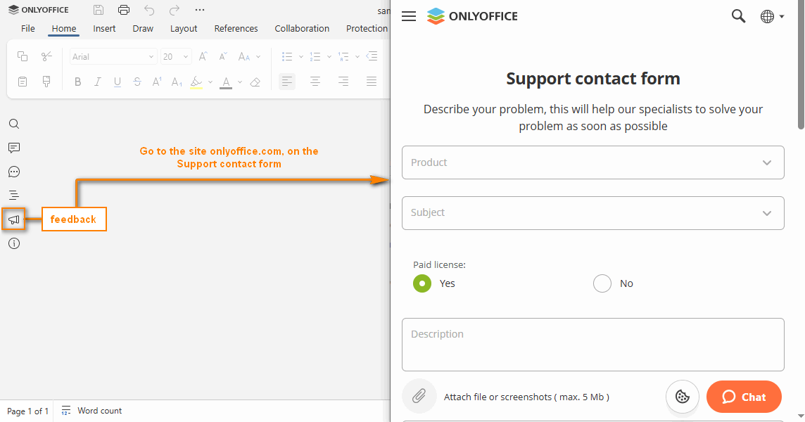
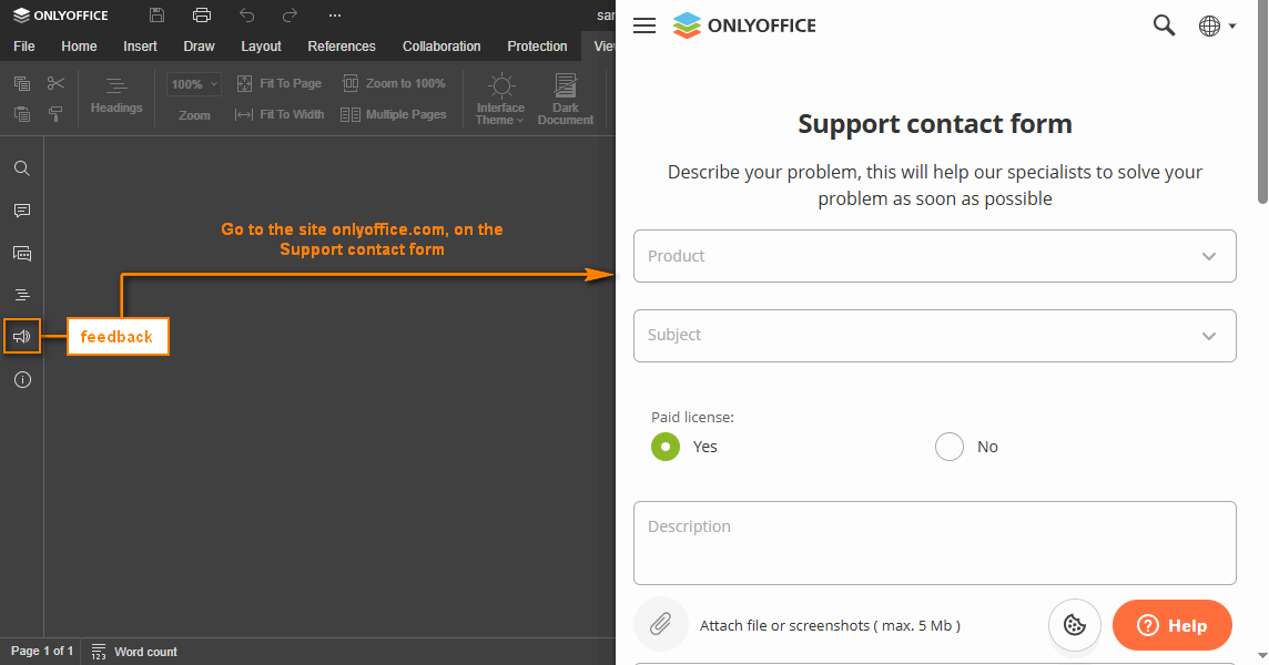
feedback
type: boolean | object | default: false
The settings for the Feedback & Support menu button. If set to false, the button is hidden.
Example:
{
  url: "https://example.com",
  visible: true,
}
feedback.url
type: string
The absolute URL to the website which will be opened when clicking the Feedback & Support menu button.
Example: "https://example.com"
feedback.visible
type: boolean | default: false
Shows or hides the Feedback & Support menu button.
Example: true
forcesave
type: boolean | default: false
Adds the request for the file force saving to the callback handler when saving the document within the document editing service (e.g. clicking the Save button, etc.).
In case this setting is changed in the editor interface, it will be stored in the browser local storage and will overwrite any values sent as the editorConfig.customization.forcesave parameter.
Example: false
forceWesternFontSize
type: boolean | default: false
The font size used in the Chinese (Simplified) UI. If set to true, the Western font size is used. If set to false, the Chinese font size is used.
Example: false
goback
type: object
The settings for the Open file location menu button and upper right corner button.
Example:
{
  blank: true,
  text: "Open file location",
  url: "https://example.com",
}


goback.blank
type: boolean | default: true
Opens the website in the new browser tab/window (if the value is set to true) or the current tab (if the value is set to false) when the Open file location button is clicked.
Example: true
goback.requestClose
type: boolean
Whether clicking the Open file location button calls the events.onRequestClose event instead of opening a browser tab or window.
Starting from version 8.1, please use the close parameter instead.
Example: false
goback.text
type: string
The text which will be displayed for the Open file location menu button and upper right corner button (i.e. instead of Go to Documents).
Example: "Open file location"
goback.url
type: string
The absolute URL to the website address which will be opened when clicking the Open file location menu button.
Example: "https://example.com"
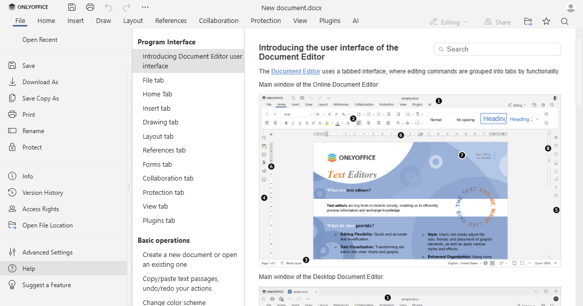
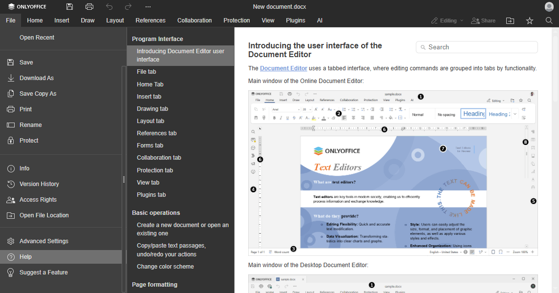
help
type: boolean | default: true
Whether to display the Help menu button.
Example: true
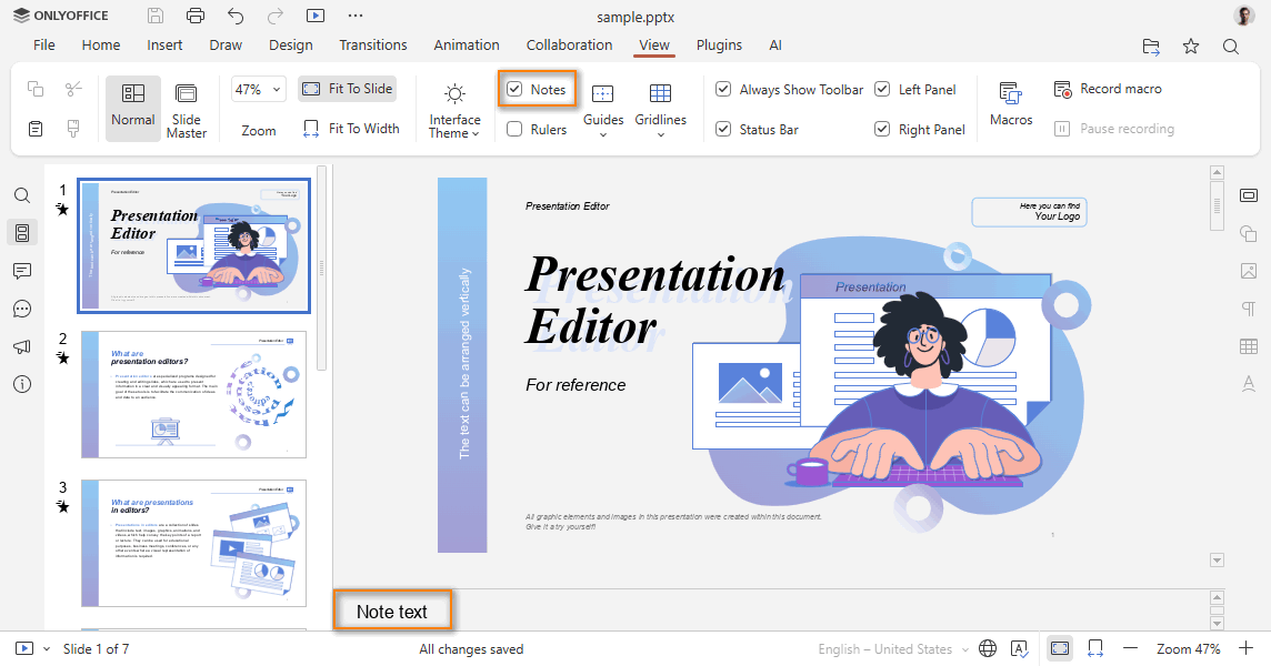
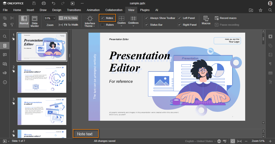
hideNotes
type: boolean | default: false
Whether to display the note panel on first loading. This parameter is available for the presentation editor only.
In case this setting is changed in the editor interface, it will be stored in the browser local storage and will overwrite any values sent as the editorConfig.customization.hideNotes parameter.
Example: false
hideRightMenu
type: boolean | default: true
Whether to display the right menu on first loading.
In case this setting is changed in the editor interface, it will be stored in the browser local storage and will overwrite any values sent as the editorConfig.customization.hideRightMenu parameter.
Example: true
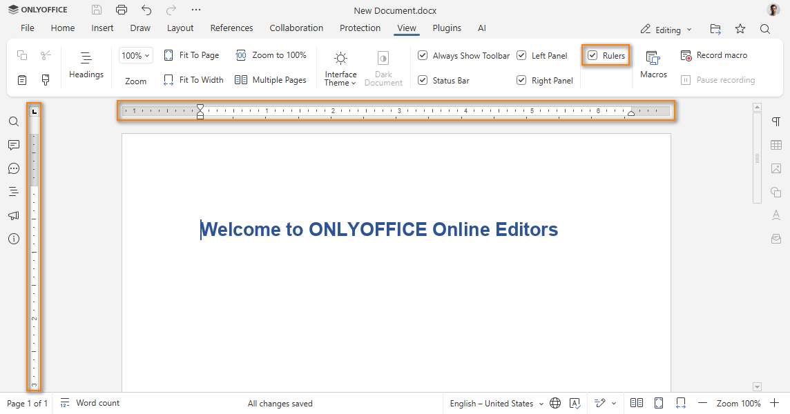
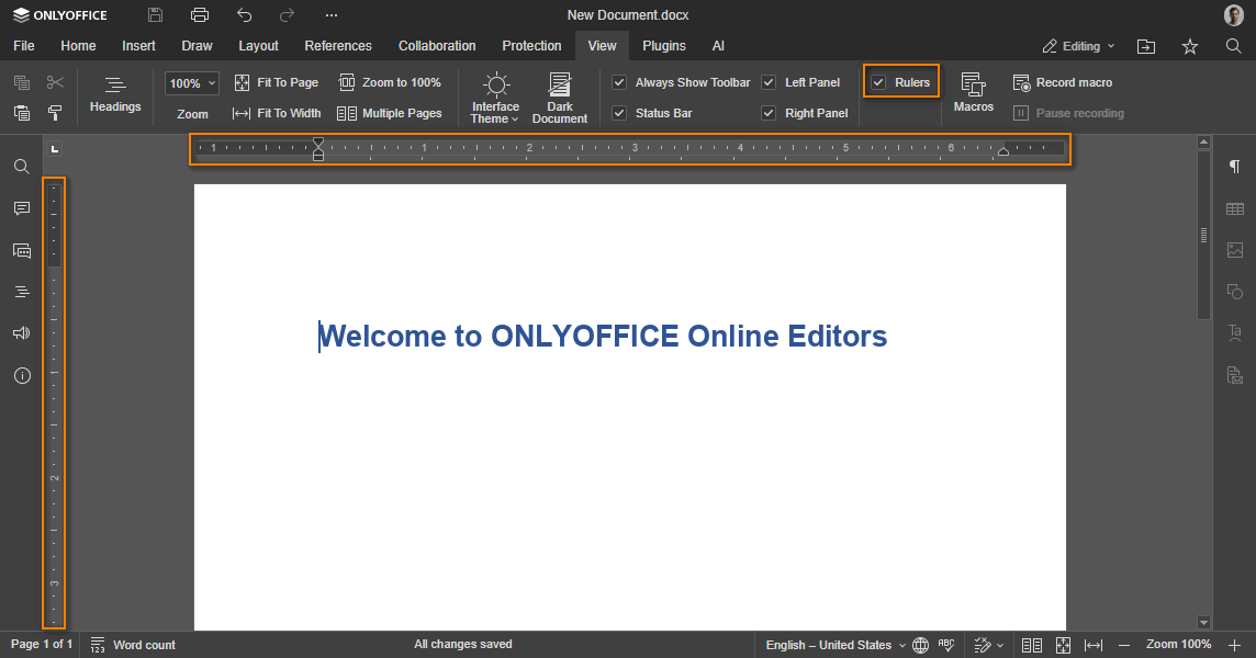
hideRulers
type: boolean
Whether to display the editor rulers. This parameter is available for the document and presentation editors. The default value is false for the document editor and true for the presentation editor.
Example: false
integrationMode
type: string
The mode of embedding editors into the web page. The embed value disables scrolling to the editor frame when it is loaded as the focus is not captured.
Example: "embed"
logo
type: object
Changes the image file at the top left corner of the editor header. The recommended image height is 20 pixels.
This parameter is available only for ONLYOFFICE Docs Developer.
Example:
{
  image: "https://example.com/logo.png",
  imageDark: "https://example.com/dark-logo.png",
  imageLight: "https://example.com/light-logo.png",
  url: "https://example.com",
  visible: true,
}

logo.image
type: string
Path to the image file used to show in the common work mode (view and edit modes for all editors) or in the embedded mode. The image must have the following size: 300x20.
Example: "https://example.com/logo.png"
logo.imageDark
type: string
Path to the image file used for the dark header (for example, in a dark theme or in a theme with a colored header). The image must have the following size: 300x20.
Example: "https://example.com/dark-logo.png"
logo.imageLight
type: string
Path to the image file used for the light header (for example, in the Gray theme). The image must have the following size: 300x20.
Example: "https://example.com/light-logo.png"
logo.imageEmbedded
type: string
Path to the image file used to show in the embedded mode (see the config section to find out how to define the embedded document type). The image must have the following size: 248x40.
Starting from version 7.0, please use the logo.image field instead.
Example: "https://example.com/logo_em.png"
logo.url
type: string
The absolute URL to open when the logo image is clicked. Leave as an empty string or null to make the logo not clickable.
Example: "https://example.com"
logo.visible
type: boolean | default: true
Shows or hides the logo.
Example: true
macros
type: boolean | default: true
Whether document macros will be automatically run when the editor opens.
- Before version 9.0.3: the
falsevalue disables the automatic startup of macros and hides the macros settings from the user. - Since version 9.0.3: the
falsevalue completely disables macros — they cannot be run, added, or edited. The Macros button is also hidden from the View tab.
Example: true
macrosMode
type: "disable" | "warn" | "enable" | default: "warn"
The macros run mode when autostart is enabled. Can take the following values:
disable- don't run macros at all;warn- warn about macros and ask permission to run them;enable- run all macros automatically.
In case this setting is changed in the editor interface, it will be stored in the browser local storage and will overwrite any values sent as the editorConfig.customization.macrosMode parameter.
Example: "warn"
mentionShare
type: boolean | default: true
The hint that describes the event after mentions in a comment. If true, a hint indicates that the user will receive a notification and access to the document. If false, a hint indicates that the user will receive only a notification of the mention.
It will only be available for the comments if the onRequestSendNotify event is set.
Example: true


mobile
type: object
The mobile document editor settings.
Example:
{
  forceView: true,
  info: false,
  standardView: false,
}
mobile.forceView
type: boolean | default: true
Whether the view mode is enabled on launch in the mobile document editor.
Example: true
mobile.info
type: boolean | default: false
Whether to display the Document Info button in the mobile document editor.
Example: false
mobile.standardView
type: boolean | default: false
Whether the editor will be opened in Standard view instead of Mobile view.
Example: false
mobile.disableForceDesktop
type: boolean | default: false
Whether to hide the UI option to switch the editor to the Desktop type on mobile devices.
Example: false
mobileForceView
type: boolean | default: true
Whether the mobile document editor is opened in the view/edit mode on launch.
Starting from version 8.2, please use the mobile parameter instead.
Example: true
plugins
type: boolean | default: true
Whether plugins will be launched and available.
Example: true
pointerMode
type: "select" | "hand" | default: "select"
The pointer mode when the presentation editor is loaded in the viewer. If set to select, the selection mode is used. If set to hand, the hand mode is used.
Example: "select"


review
type: object
Contains the information about the review mode.
In case this setting is changed in the editor interface, it will be stored in the browser local storage and will overwrite any values sent as the editorConfig.customization.review.hoverMode and the editorConfig.customization.review.reviewDisplay parameters.
The showReviewChanges, reviewDisplay, trackChanges parameters are deprecated since version 7.0. Please use the review parameter instead.
Example:
{
  hideReviewDisplay: false,
  showReviewChanges: false,
  reviewDisplay: "original",
  trackChanges: true,
  hoverMode: false,
}
review.hideReviewDisplay
type: boolean | default: false
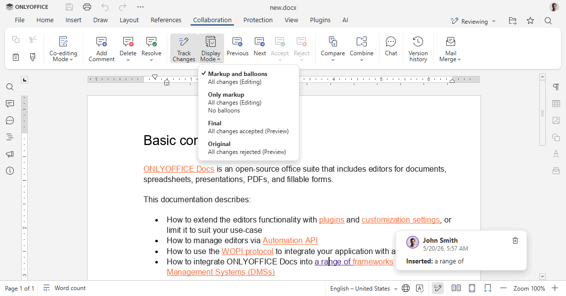
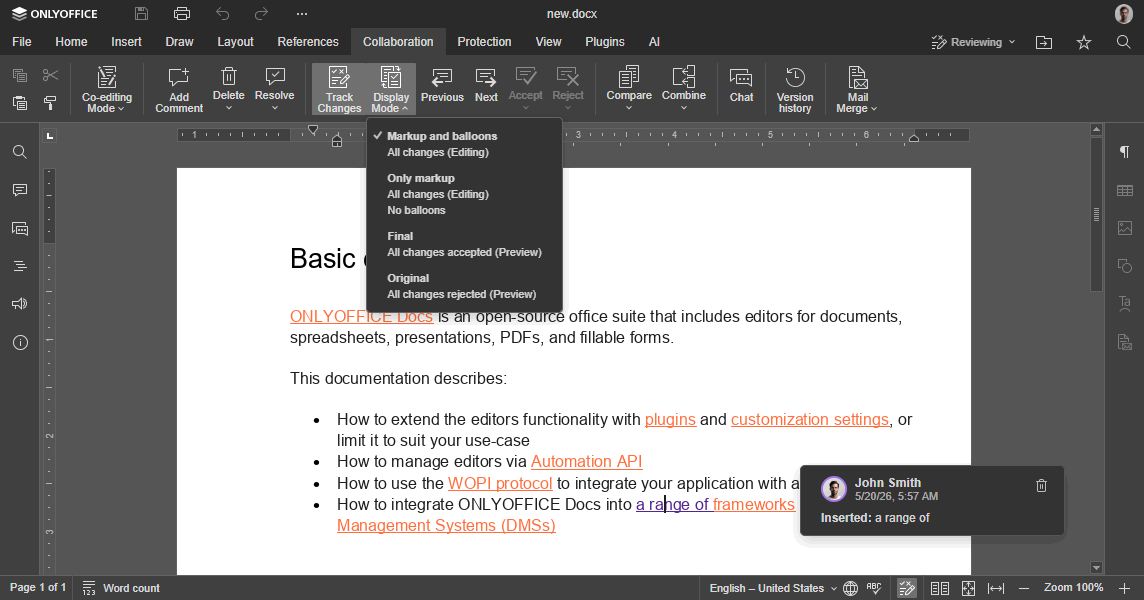
Whether to display the Display mode button on the Collaboration tab.
Example: false
review.hoverMode
type: boolean | default: false
The review display mode. If set to true, reviews are shown in tooltips by hovering the changes. If set to false, reviews are shown in balloons by clicking the changes.
Example: false
review.reviewDisplay
type: "markup" | "simple" | "final" | "original"
The review display mode for the document editor. The default value is original for viewer and markup for editor. This setting works in any mode, but editing is only possible when markup or simple is selected. If original or final is selected, the editor automatically switches to view-only mode. Can take the following values:
markup- the document is displayed with proposed changes highlighted;simple- the document is displayed with proposed changes highlighted, but the balloons are turned off;final- the document is displayed with all the proposed changes applied;original- the original document is displayed without the proposed changes.
Example: "original"
review.showReviewChanges
type: boolean | default: false
Whether to display the review changes panel when the editor is loaded.
Example: false
review.trackChanges
type: boolean
Whether to enable the review editing mode for the current user. This parameter overrides document.permissions.review. If set to true, the review mode is enabled. If set to false, it is disabled. If undefined, the document.permissions.review value is applied instead.
Example: true
reviewPermissions
type: object
The groups that can accept/reject review changes made by other groups. Each key is a group name, and the value is an array of group names whose review changes that group can manage. The "" value in the array means changes made by users who don't belong to any group.
This parameter is used together with the user.group field and the document.permissions.reviewGroups parameter.
Example:
{
  "Group1": ["Group2"],
  "Group2": ["Group1", "Group2"],
  "Group3": [""],
}
In this example:
- users from Group1 can accept/reject review changes made by users from Group2;
- users from Group2 can accept/reject review changes made by users from Group1 and Group2;
- users from Group3 can accept/reject review changes made by users who don't belong to any group.
reviewDisplay
type: "markup" | "simple" | "final" | "original"
The review editing mode in the document editor. This parameter can take the following values:
markup- the document is displayed with proposed changes highlighted;simple- the document is displayed with proposed changes highlighted, but the balloons are turned off;final- the document is displayed with all the proposed changes applied;original- the original document is displayed without the proposed changes.
The default value is original for viewer and markup for editor.
In case this setting is changed in the editor interface, it will be stored in the browser local storage and will overwrite any values sent as the editorConfig.customization.reviewDisplay parameter.
Starting from version 7.0, please use the review.reviewDisplay parameter instead.
Example: "original"
showHorizontalScroll
type: boolean | default: true
Whether to display the horizontal scroll when the spreadsheet editor is loaded.
Example: true
showReviewChanges
type: boolean | default: false
Whether to display the review changes panel when the editor is loaded.
Starting from version 7.0, please use the review.showReviewChanges parameter instead.
Example: false
showVerticalScroll
type: boolean | default: true
Whether to display the vertical scroll when the spreadsheet editor is loaded.
Example: true
slidePlayerBackground
type: string
The background color for the slide show in the presentation editor. Can be represented in the HEX, RGB, or RGBA formats: #ff0000, rgb(255, 0, 0), rgba(255, 0, 0, 0.5).
Example: "#000000"
spellcheck
type: boolean | default: true
Whether the spell checker is automatically switched on or off when the editor is loaded. Spell checker will only be available for the document editor and the presentation editor.
In case this setting is changed in the editor interface, it will be stored in the browser local storage and will overwrite any values sent as the editorConfig.customization.spellcheck parameter.
Starting from version 7.1, please use the features.spellcheck parameter instead.
Example: true
startFillingForm
type: object
The Start filling button settings in PDF form editing mode.
Example:
{
  text: "Share & collect",
}
startFillingForm.text
type: string | default: "Start filling"
The caption of the Start filling button in PDF form editing mode.
Example: "Share & collect"
submitForm
type: object | boolean | default: true
The Complete & Submit button settings. If set to false, the button is hidden. The button will only be available for the pdf format.
Example:
{
  visible: true,
  resultMessage: "Form submitted successfully",
}



submitForm.visible
type: boolean | default: true
Whether to display the Complete & Submit button on the top toolbar. The button will only be available for the pdf format.
Example: true
submitForm.resultMessage
type: string
A message displayed after forms are submitted. The following values are available:
""- the message will not be displayed;null/undefined- the default message will be displayed;"your text"- a custom message will be displayed.
Example: "Form submitted successfully"
suggestFeature
type: boolean | default: true
Whether to display the Suggest a Feature menu button.
Example: true
toolbarHideFileName
type: boolean | default: false
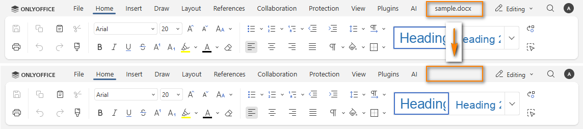
Whether the document title is hidden on the top toolbar. If set to false, the title is visible. If set to true, the title is hidden.
This setting is used when the compactHeader parameter is set to true.
Example: false

toolbarNoTabs
type: boolean | default: false
The top toolbar tabs display style. If set to false, the tabs are distinctly displayed. If set to true, the tabs are only highlighted to see which one is selected.
Starting from version 8.2, please use the editorConfig.customization.features.tabStyle parameter which is set to line and the editorConfig.customization.features.tabBackground parameter which is equal to toolbar.
Example: false
trackChanges
type: boolean
Whether to enable the review editing mode for the current user. This parameter overrides document.permissions.review. If set to true, the review mode is enabled. If set to false, it is disabled. If undefined, the document.permissions.review value is applied instead.
Starting from version 7.0, please use the review.trackChanges parameter instead.
Example: true
uiTheme
type: string
The editor theme settings. It can be set in two ways:
- theme id - the user sets the theme parameter by its id:
theme-system,theme-light,theme-classic-light,theme-dark,theme-contrast-dark,theme-gray,theme-white,theme-night; - default theme - the default dark or light theme value will be set:
default-dark,default-light. The default light theme istheme-white, the default dark theme istheme-night.
When the editor is opened, the theme is applied in the following priority order: the theme last selected by the user in the editor takes the highest priority, then the uiTheme parameter from the configuration, and the default theme is applied if neither is set.
The theme-system value matches the OS color scheme preference (light or dark).
Apart from the available editor themes, the user can also customize their own color themes for the application interface.
In case this setting is changed in the editor interface, it will be stored in the browser local storage and will overwrite any values sent as the editorConfig.customization.uiTheme parameter.
For the mobile editors, only the following themes are currently supported: theme-light, theme-dark, theme-system, default-light, default-dark.
Example: "theme-dark"
unit
type: "cm" | "pt" | "inch" | default: "cm"
The measurement units used on the ruler and in dialog boxes. Can take the following values:
cm- centimeters;pt- points;inch- inches.
In case this setting is changed in the editor interface, it will be stored in the browser local storage and will overwrite any values sent as the editorConfig.customization.unit parameter.
Example: "cm"
wordHeadingsColor
type: string
The HEX color for the default heading styles in the document editor.
Example: "#00ff00"
zoom
type: integer | default: 100
The document display zoom value measured in percent. Can take values larger than 0. For documents and presentations it is possible to set this parameter to -1 (fitting the document to page option) or to -2 (fitting the document page width to the editor page).
In case this setting is changed in the editor interface, it will be stored in the browser local storage and will overwrite any values sent as the editorConfig.customization.zoom parameter.
Example: 100
Example
const config = {
  // ...
  editorConfig: {
    // ...
    customization: {
      anonymous: {
        request: true,
        label: "Elizabeth",
      },
      autosave: true,
      close: {
        visible: true,
        text: "Close file",
      },
      comments: true,
      compactHeader: false,
      compactToolbar: false,
      compatibleFeatures: false,
      customer: {
        address: "My City, 123a-45",
        info: "Some additional information",
        logo: "https://example.com/logo-big.png",
        logoDark: "https://example.com/dark-logo-big.png",
        mail: "john@example.com",
        name: "John Smith and Co.",
        phone: "123456789",
        www: "example.com",
      },
      features: {
        featuresTips: true,
        roles: true,
        spellcheck: {
          mode: true,
        },
        tabBackground: {
          mode: "header",
          change: true,
        },
        tabStyle: {
          mode: "fill",
          change: true,
        },
      },
      feedback: {
        url: "https://example.com",
        visible: true,
      },
      forcesave: false,
      forceWesternFontSize: false,
      goback: {
        blank: true,
        text: "Open file location",
        url: "https://example.com",
      },
      help: true,
      hideNotes: false,
      hideRightMenu: true,
      hideRulers: false,
      integrationMode: "embed",
      logo: {
        image: "https://example.com/logo.png",
        imageDark: "https://example.com/dark-logo.png",
        imageLight: "https://example.com/light-logo.png",
        url: "https://example.com",
        visible: true,
      },
      macros: true,
      macrosMode: "warn",
      mentionShare: true,
      mobile: {
        forceView: true,
        info: false,
        standardView: false,
      },
      plugins: true,
      pointerMode: "select",
      review: {
        hideReviewDisplay: false,
        showReviewChanges: false,
        reviewDisplay: "original",
        trackChanges: true,
        hoverMode: false,
      },
      showHorizontalScroll: true,
      showVerticalScroll: true,
      slidePlayerBackground: "#000000",
      submitForm: {
        visible: true,
        resultMessage: "Form submitted successfully",
      },
      suggestFeature: true,
      toolbarHideFileName: false,
      uiTheme: "theme-dark",
      unit: "cm",
      wordHeadingsColor: "#00ff00",
      zoom: 100,
    },
  },
};

const docEditor = new DocsAPI.DocEditor("placeholder", config);
The example.com is the name of the server where document manager and document storage service are installed. See the How it works section to find out more on ONLYOFFICE Docs service client-server interactions.